
How to Make a Pyramid Chart in PowerPoint
In the fast-paced world of corporate strategy and market research, data density is both a blessing and a curse. You possess the metrics, the competitive insights, and the strategic roadmaps, but if your audience is forced to wade through dense walls of text or decipher complex spreadsheets, your core message loses its impact.
Whether you are mapping out a multi-layered market entry strategy, illustrating a customer acquisition funnel, or defining organizational hierarchies, the pyramid chart is a visual powerhouse. It leverages a universal cognitive shortcut, humans naturally associate structure, scale, and priority with geometric progression.
The broad base anchors your foundational data, while the tapering peak draws the viewer’s eye straight to the ultimate strategic objective. It is the ideal framework for delivering investor-ready clarity at a single glance. If you are still not aware of how to add those pyramid charts in PowerPoint, here is the guide.
Step-by-Step Guide to Create a Perfect Pyramid Chart in PowerPoint
Pyramid charts are a powerhouse for visual storytelling. Whether you are illustrating hierarchical data, a sales funnel, or priority levels, a pyramid chart translates complex structures into an instantly understandable visual. Here is a comprehensive, step-by-step guide to building a clean, professional pyramid chart in Microsoft PowerPoint, along with design tips to make your data pop.
- Method 1: SmartArt (Fastest)
If you need a clean, standard pyramid chart in under two minutes, PowerPoint’s built-in SmartArt is your best option. It handles the alignment and spacing automatically.
Step 1: Insert the SmartArt Graphic
- Open your PowerPoint presentation and navigate to the slide where you want the chart.
- Go to the Insert tab on the top ribbon.
- Click on SmartArt in the Illustrations group.
Step 2: Choose Your Pyramid Layout
- In the SmartArt dialog box, click on the Pyramid category in the left sidebar.
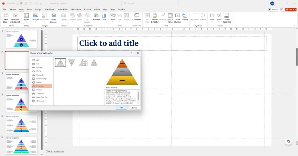
- Select the layout that best fits your data:
- Basic Pyramid: Ideal for showing hierarchical relationships.
- Inverted Pyramid: Perfect for sales funnels or filtering processes.
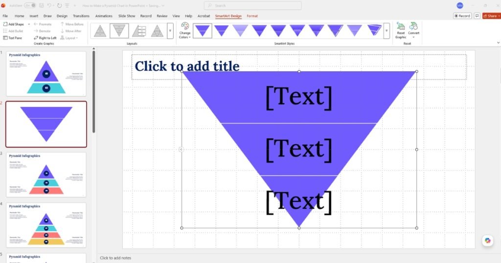
- Segmented Pyramid: Great for showing proportional relationships.
- Click OK.
Step 3: Populate Your Data
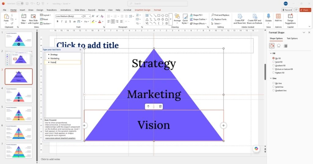
- Click the small arrow icon on the left border of the SmartArt graphic to open the Text Pane ( highlighted with area mark).
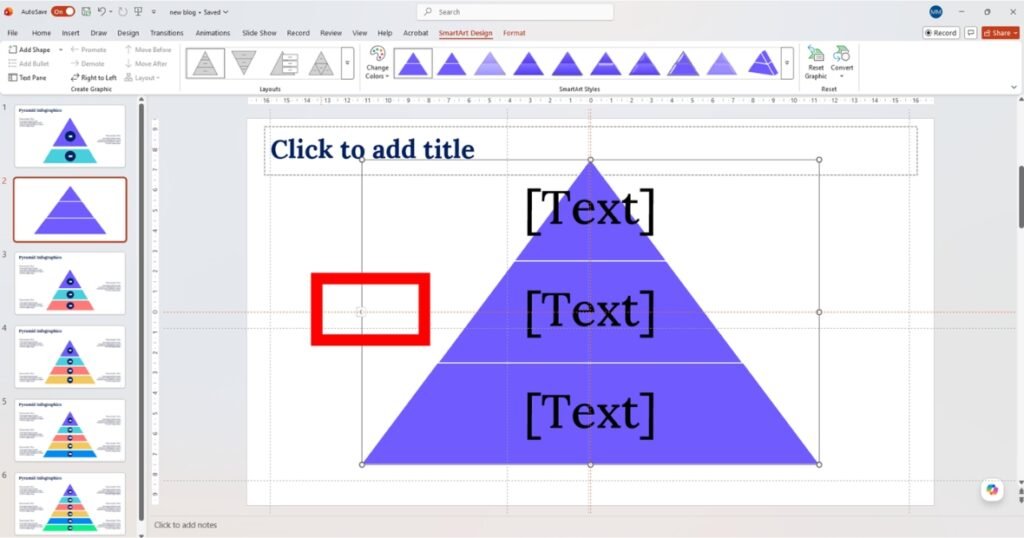
- Type your labels into the bulleted list. The top bullet corresponds to the top of the pyramid.
- To add more layers, simply press Enter to create a new bullet point.
Step 4: Customize the Design
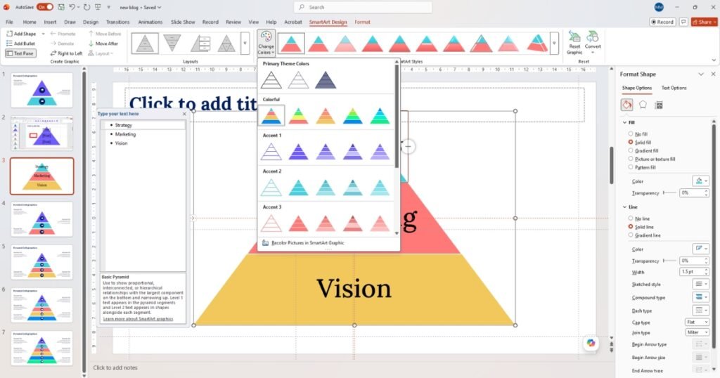
- Change Colors: Select the pyramid, go to the SmartArt Design tab, and click Change Colors to match your brand palette.
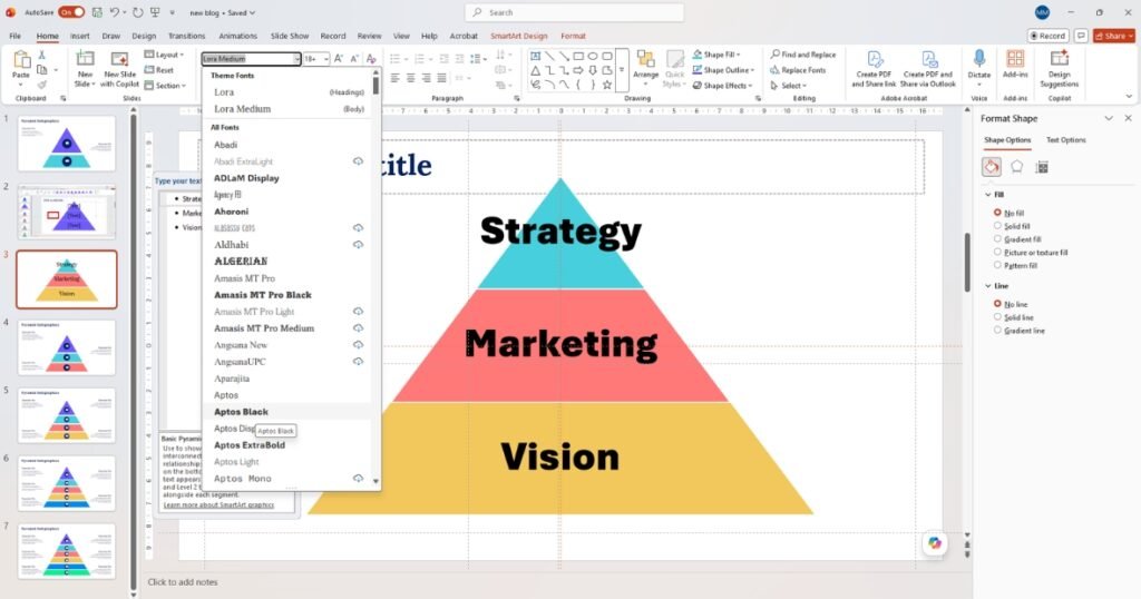
- Format Text: You can modify the font size, color, and style directly from the Home tab to ensure maximum readability.
Pros and Cons of SmartArt
- Pros: Fast setup, auto-resizing tiers, easy to add/remove layers, built-in color themes.
- Cons: Limited custom sizing, tier widths are not editable, less control over exact positioning.
Method 2: The Bespoke Way (Using Shapes for Total Control)
If you want a highly customized, modern look like a floating or spaced pyramid, building it manually with shapes gives you absolute creative freedom.
- Go to the Insert tab, click Shapes, and select the Isosceles Triangle.
- Go to the Insert tab, click Shapes, and select the Isosceles Triangle.
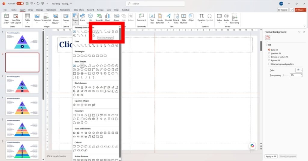
- Click and drag on your slide to draw a large triangle. This will serve as your canvas.
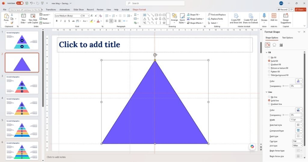
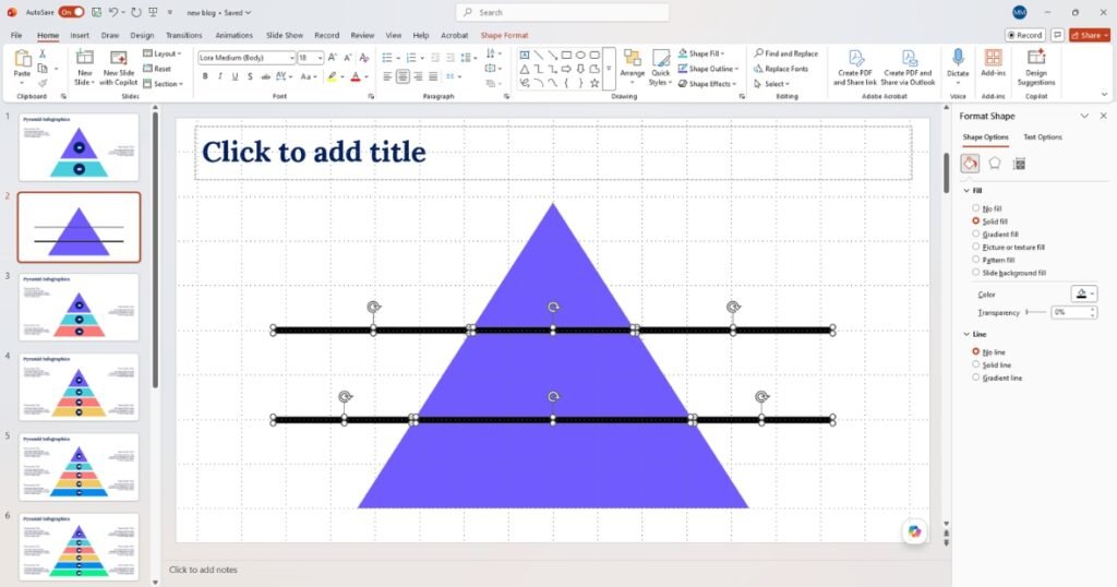
To create distinct layers, we will use horizontal rectangles to cut the triangle evenly.
- Insert a Rectangle shape (Insert > Shapes > Rectangle).
- Draw a thin, horizontal rectangle across the triangle where you want your first split.
- Duplicate this rectangle (Ctrl + D or Cmd + D) and position the duplicates at the other layer intervals.
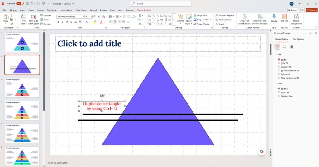
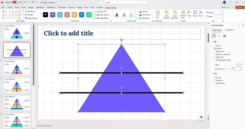
- Select the main triangle first, then hold Shift and select all the horizontal rectangles.
- Navigate to the Shape Format tab.
- Click Merge Shapes (left side of the ribbon) and select Fragment.
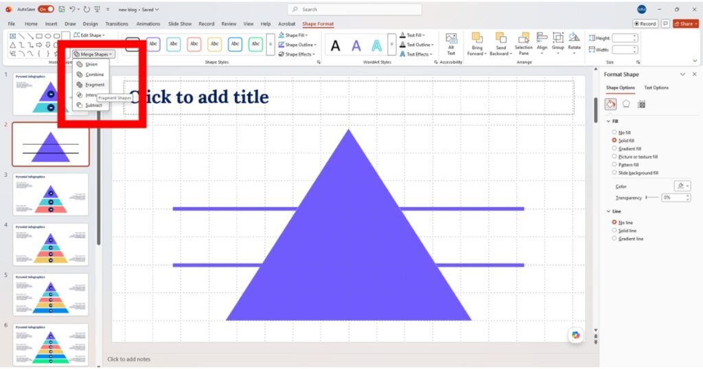
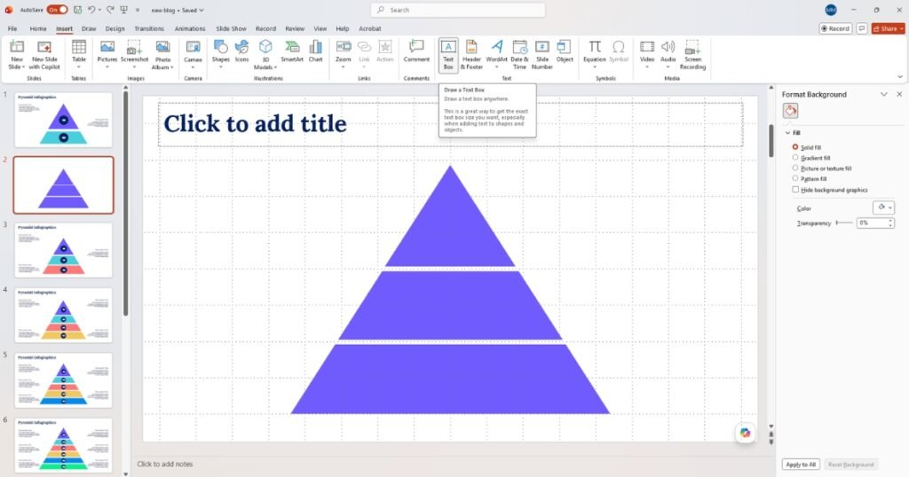
- Delete the leftover pieces outside the triangle and the thin divider lines. You are left with perfectly stacked, individual pyramid segments.
- Select each segment individually to change its fill color.
- Use a gradient progression (e.g., dark blue at the base to light blue at the top) to signify depth or priority.
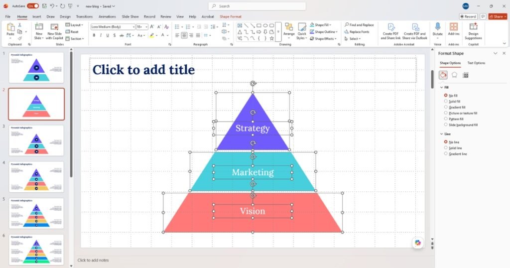
- Use Text Boxes (Insert > Text Box) placed next to or inside each layer to add your descriptions and metrics.
Formatting and Styling
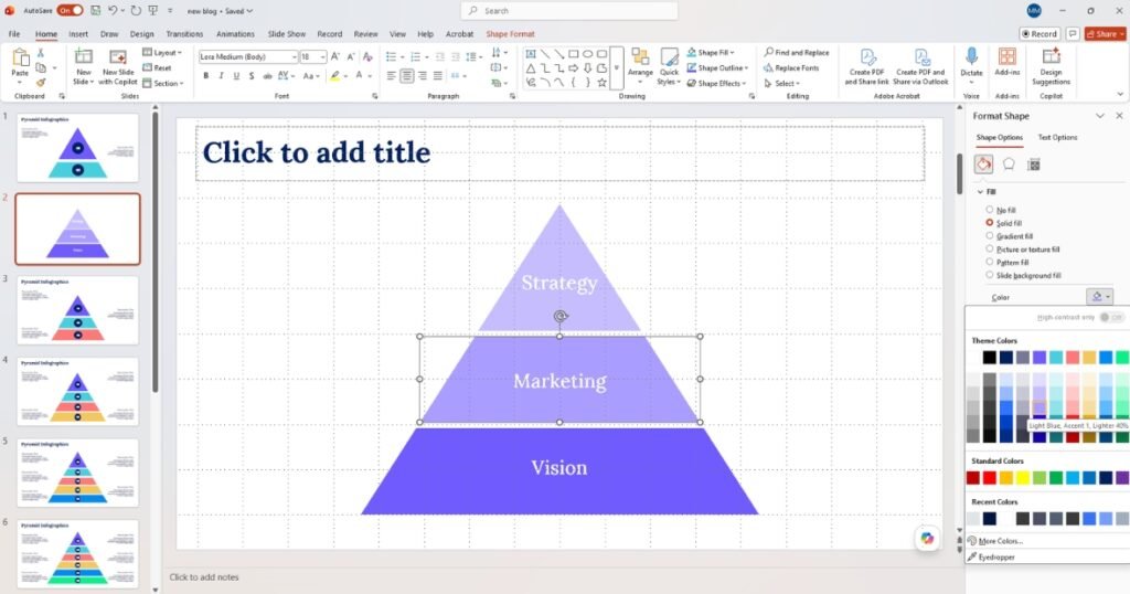
- Click each tier individually and apply a fill color from Shape Format → Shape Fill. Best practice: use a single color in graduated shades, darker at the base, lighter toward the top to create natural visual hierarchy.
- Monochromatic gradient: Pick one hue and use 5 tints from dark to light. Professional and cohesive.
- Traffic light (red to amber to green): Good for risk or priority pyramids.
- Brand Colors: Match your company color palette for corporate presentations.
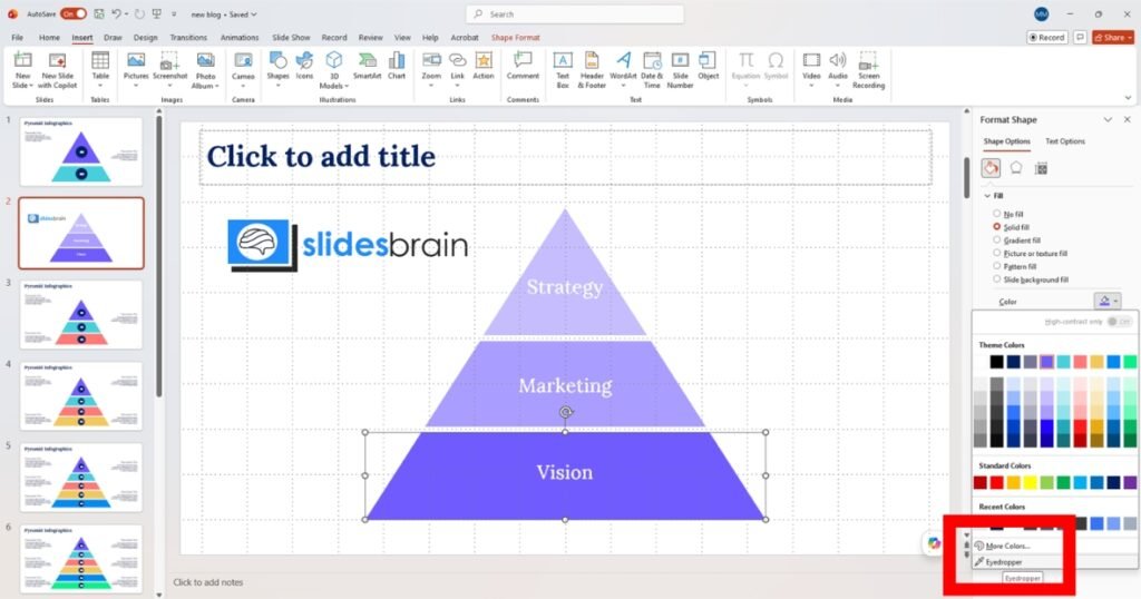
Tip: Use the Eyedropper tool in Shape Fill to sample colors from your company logo for perfect brand matching.
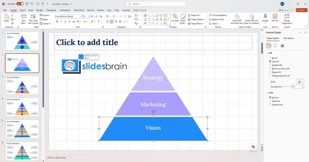
- Select all tiers and go to Shape Format → Shape Outline. Common choices:
- No Outline: Clean, modern look. Best when colors are distinct enough to separate tiers.
- White 1-2pt outline: Creates crisp separation between closely-colored tiers.
- Dark outline 0.5pt, Traditional, structured look for formal business slides.
Adding Text and Labels
Double-click any tier shape to enter text-editing mode. Type your label directly inside. For readability:
- Use white text on dark or colored fills — set via Home → Font Color.
- Keep font size between 12-18pt to avoid overflowing the tier boundaries.
- Center-align text: right-click shape → Format Shape → Text Box → Vertical alignment: Middle.
- Use bold for tier titles and regular weight for sub-labels.
For detailed descriptions, add text boxes outside the pyramid connected to each tier with a line or arrow.
- Insert a Text Box (Insert → Text Box) beside each tier and type the description.
- Draw a connector line: Insert → Shapes → Lines → Line (drag from the text box to the tier edge).
- Align all callout boxes: select them → Shape Format → Align → Distribute Vertically.
Tip: Place labels consistently — all on the right side or all on the left. Alternating sides creates visual confusion.
Method 3: Use a SlidesBrain Pre-Built Pyramid Chart Template (Fastest for Professionals)
If you are under a deadline or need a presentation that looks polished straight out of the box, building a pyramid from scratch is the slowest path forward. This is where SlidesBrain’s Pyramid Infographic Templates become your biggest asset.
Rather than spending 30–45 minutes on shape alignment, color gradients, and text formatting, you can open a professionally designed template and have your pyramid chart ready in under five minutes.
Step 1: Choose Your Pyramid Template
Head to SlidesBrain’s Pyramid Infographics collection and select the template that best fits your use case:

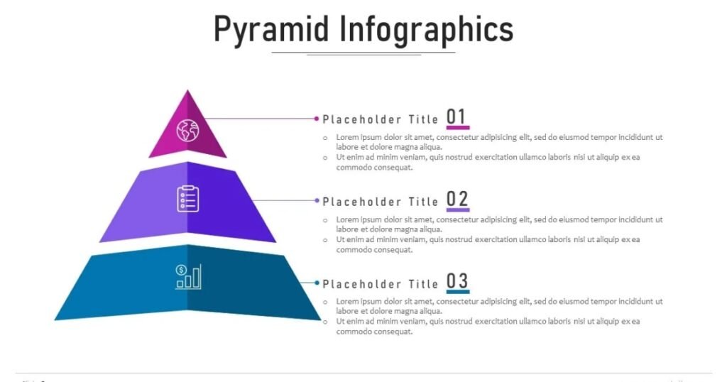
- Pyramid Infographics: A versatile multi-layout pack with 19 slides in blue, pink, and purple. Ideal for strategy hierarchies, organisational structures, and priority frameworks.
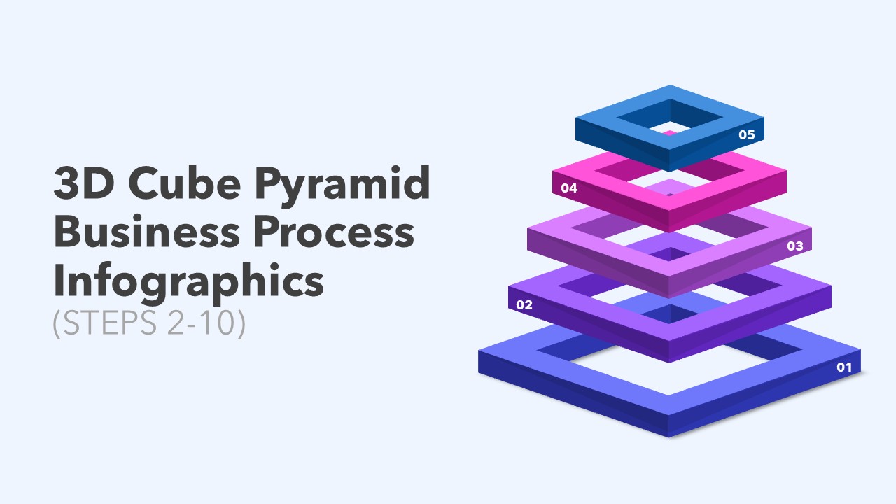
- 3D Cube Pyramid Business Process Steps: Features 2-to-10-tier pyramid variations, perfect for process flows, maturity models, and staged roadmaps. Available in blue, pink, and purple.
- Maslow Hierarchy of Needs Infographics: A 14-slide pack modelled on the classic five-tier pyramid structure. Works excellently for behavioural segmentation, customer journey mapping, and HR frameworks.

- Iceberg Template Infographics PowerPoint: A 26-slide pack that combines pyramid-style visual hierarchy with an iceberg metaphor. Powerful for risk analysis, competitive intelligence, and market research presentations.

Step 2: Download and Open in PowerPoint or Google Slides
All SlidesBrain templates are fully compatible with both Microsoft PowerPoint and Google Slides. After downloading, open the file directly. No additional plugins or software required.
Step 3: Replace the Placeholder Text
Each tier already has text placeholders. Simply click on any label and type your own data. The font sizing, alignment, and spacing are all pre-configured to professional standards so you do not need to adjust anything manually.
Step 4: Swap Colors to Match Your Brand
Every template uses fully editable shape fills. Click any tier, navigate to Shape Format → Shape Fill, and apply your brand colors. Since the shapes are individual objects (not locked SmartArt), you have complete control — something Method 1 does not offer.
Step 5: Drop It Into Your Deck
Once your content and colors are updated, copy the slide into your existing presentation deck. The aspect ratio (16:9) is standardized across all SlidesBrain templates, so it slots in without any resize adjustments.
Pros and Cons of Using Pre-Built Templates
Pros: Presentation-ready in minutes, professionally designed layouts, full editability, compatible with PowerPoint and Google Slides, multiple style variations in one pack, no alignment or color-gradient work required.
Pro Tips for a Polished Pyramid
- Use 3 to 6 tiers maximum. More than 6 tiers creates visual clutter and tiny, unreadable labels.
- Equal tier heights look balanced. Vary heights only if you want to visually encode quantity.
- Add subtle animations. Animate tiers to appear one at a time (Appear effect) from base to top.
- Save as a template. Right-click the grouped shape and select Save as Picture to reuse it in future decks.
- Consider an inverted pyramid if your data flows from broad to narrow (e.g., a sales funnel).
- Use high-contrast colors for accessibility. Test your slide in grayscale to confirm tiers are still distinguishable.
Common Mistakes to Avoid
- Too many colors. Using a different color for every tier looks chaotic. Stick to 2-3 colors with tints/shades.
- Misaligned tiers. Even slightly off-center tiers are immediately noticeable. Always use the Align tools.
- Inconsistent font sizes. Each tier label should use the same font size or a consistent scaling rule.
- Overcrowding text. If the label doesn’t fit inside the tier, increase tier height or use external callout labels.
- Unnecessary 3-D effects. Heavy 3-D shadows look dated. Flat designs read more clearly on projectors and screens.
Conclusion: Elevate Your Presentation with Premium Templates
Mastering PowerPoint’s built-in tools gives you the flexibility to build functional diagrams, but executing a truly flawless design takes time. When you are balancing tight deadlines, deep market research, and high-stakes stakeholder expectations, you cannot afford to spend hours adjusting shape alignments or formatting color gradients from scratch.
Your audience deserves data that tells a story, and your schedule demands efficiency.
Streamline Your Workflow with SlidesBrain
If you want to skip the manual build and immediately access presentation-ready visuals, SlidesBrain has you covered.
SlidesBrain offers an extensive library of professionally designed fully customizable pyramid chart templates. Built specifically for corporate strategists, market researchers, and analysts, these templates ensure your data looks polished, structured, and investor-ready in seconds.
❓ Frequently Asked Questions
How do I add more layers or tiers to a SmartArt pyramid?
Click on your pyramid. A small box with text will pop up on the left side. Go to that text list, click on a line, and press Enter on your keyboard. A new layer will appear automatically!
Can I turn a regular pyramid into an inverted pyramid (funnel chart)?
If using SmartArt: Click the pyramid, go to the SmartArt Design tab at the top, click Change Layout, and choose the upside-down pyramid.
If using Shapes: Select your shapes, go to Shape Format → Rotate, and click Flip Vertical.
How do I change the color of just one single tier in SmartArt?
If you click a SmartArt pyramid, it usually changes the color of the whole thing. To change just one part, click twice slowly on the exact layer you want to change. Once only that layer is selected, go to Shape Format → Shape Fill and pick your color.
Why is my text tiny or overlapping at the top of the pyramid?
Because the top of a pyramid is pointy and narrow, there is no room for text. The easiest fix is to put the text box outside the pyramid, right next to the top point, and use a small line to connect them.
Is it better to use a 3D or flat pyramid chart for business presentations?
Keep it flat. 3D pyramids look old-fashioned and are actually harder for people to read during a meeting. Flat designs look clean, modern, and professional.